


I haven’t really posted on here much, at all, I think... (Lowkey forgot about the draft I wrote in August) but here is an update on our studio project for sem 2, 2020.
All previous work mentioned in this post is updated from July through to October 2020.
Essentially, we are making a data visualisation artefact displaying the global covid19 statistics and density based on each country. We are currently in the process of laser-cutting a base made from natural wood and it will be done using the laser-cutter machine in the Art and Design building. We are also going to source a reliable and decent projector for the data to be shown. The whole idea of this project is to basically show a physical and visual representation of how severe the active case rates are in each region of the world to date.
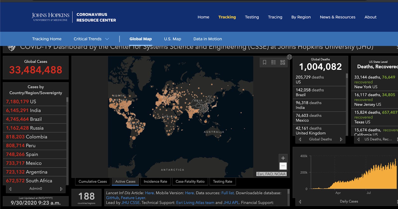
The data we are going to be using will be cited from John Hopkins University of Medicine’s main website using the ‘active cases’ visual graph as a template. We decided to use this site for information as the data and research about various sub-topics surrounding the virus are seemingly legit and accurate given its respected status according to World Health Org...
Group members
Sam - Head of research, design and create
Summer - Head of design, research and create
Artefact
The artefact is basically a natural-wood base cut into the shape of the world map, with JHU live data on global active cases projected onto the base showcasing the severity of covid-19 in various parts of the world. The moral of the project is kind of like a push, to further spread awareness about the virus. Ideally, this would be a walk-by or glance type of installation for the showcase night although we are not yet sure where we can set up until closer to the date.
Attached is a JHU data visualisation source from the John Hopkins website which acts as an ideal design guideline for our project