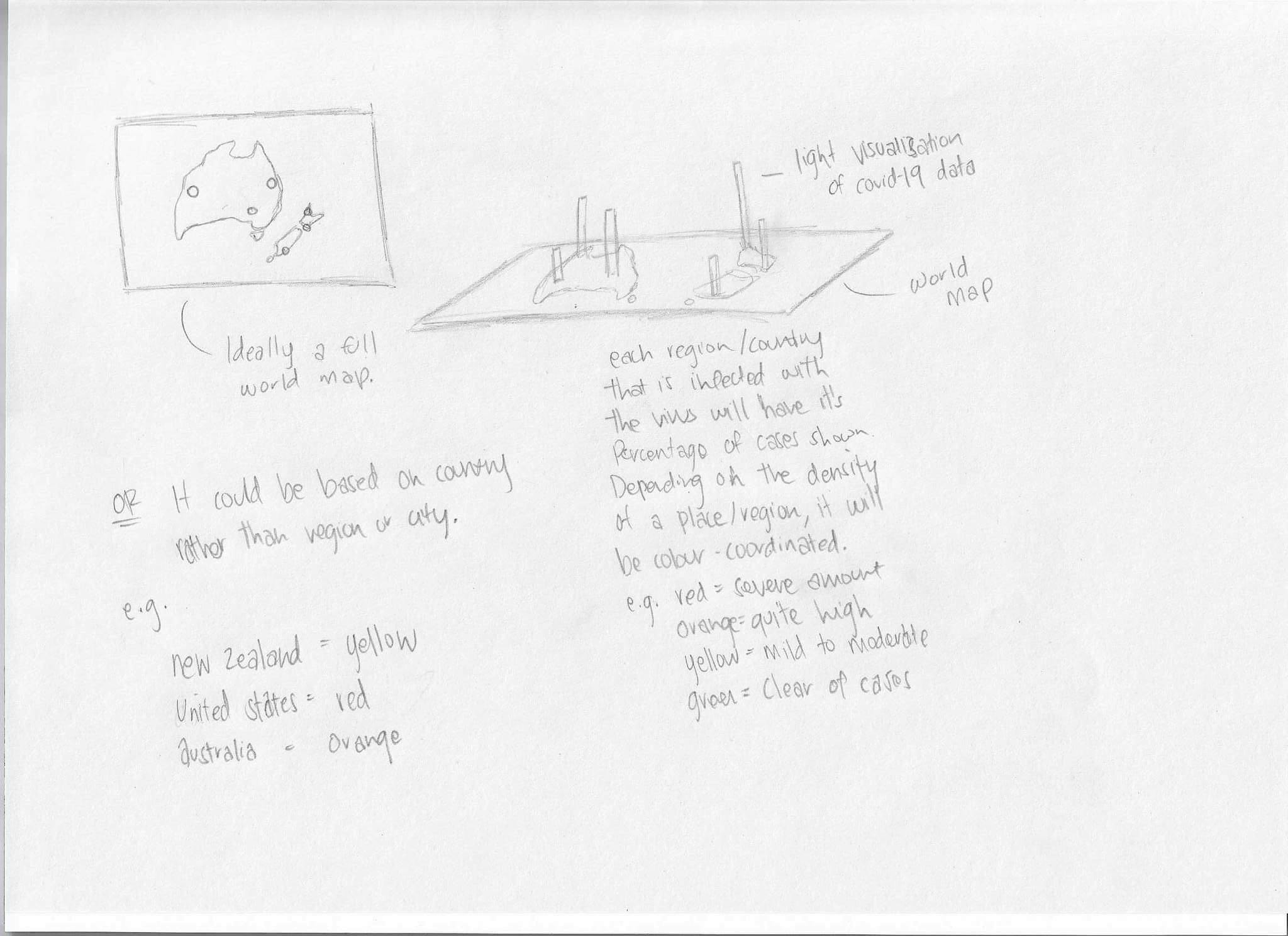
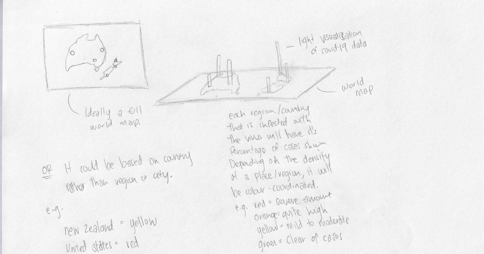
Please excuse the horrible image quality but here is a very basic concept I initially envisioned for this artifact to appear. I thought that the design would be much less complex than what we are actually planning to proceed with, which is also quite simplistic.
A flat world map diagram with protruding data measurements shows what is literally an ordinary graph. I imagined each country or demographic or region of the active cases would differ slightly in (obviously size) colour or tone but it’s still pretty similar to the JHU designs.
 Do keep in mind this was a quick yet last-minute sketch (Probably late July or early August), and drawn a while ago although I don’t think it is the worse thing I’ve ever thought of.
